Ring EU eCommerce stores
- Role:
- Front-end UI
- Company:
- Ring
- Year:
- 2020-2022
- Location:
- Amsterdam
- Location type:
- Remote
- Code stack:
- HTML CSS SASS Javascript Typescript Angular NPM Gulp Grunt Liquid / Shopify
- Tools:
- Visual Studio Code Jira Git
Project info
Objective
As Senior Front-end Developer entrusted with the development cycle of Shopify e-commerce stores, I focused on delivering front-end projects that are both responsive and engaging, ensuring an optimal interface for users and a practical platform for business owners.
Details
- Played a critical role within a small, dynamic team of developers, contributing to the enhancement of e-commerce sites.
- Integrated a variety of solutions expanding store functionality and enriching user interactions.
- Committed to writing clean, efficient, and maintainable code, prioritising performance and user experience.
- Modified existing Shopify templates to align with individual business branding and operational needs.
- Addressed and resolved technical challenges and streamlined store functionalities, enhancing overall performance.
- Conducted thorough quality assurance testing to ensure the highest standards were met and maintained.
Gallery
Click image for a larger view.
Case Studies
This list contains some of the cases I worked on, but are far from all.
Story
I designed and implemented this dynamic component tailored for a Shopify site using JavaScript, HTML, CSS, and Liquid. The primary goal was to enhance the site’s interactivity and user engagement by displaying multiple cards in a horizontally scrollable format.
I utilised the templating features of Liquid to integrate the slider seamlessly into Shopify, ensuring that it could be dynamically populated with content from the platform’s database. JavaScript was employed to handle the logic for the dynamic display and navigation functionalities, while CSS was meticulously crafted to ensure the slider’s visual appeal and responsiveness.
Implementation
- Dynamic Display: The slider dynamically adjusts the number of visible cards based on the user’s viewport.
- Endless Cards Capability: The component supports an unlimited number of cards.
- Adaptive Navigation: Arrows are integrated for easy navigation.
- Responsive Design: The entire component is fully responsives.
- Interactive Navigation Bullets: Navigation bullets are included to provide a quick visual reference for the number of cards and to facilitate easy switching between them.
Result
The component successfully enhanced the site’s functionality by providing an engaging way to display multiple pieces of content in a compact and interactive format. It improved the overall user experience by making content discovery intuitive and visually attractive.
Video
Story
We developed an ‘Interactive House’ section, designed to visually and interactively showcase Ring’s diverse range of security devices, allowing customers to envision product placement in their own homes.
The concept was envisioned as a user-centric, interactive experience embedded on the Ring homepage. As users scroll through the webpage, the section reveals SVG icons representing Ring’s security devices superimposed on a stylised background image of a house. Each icon was strategically positioned in the corresponding location one might place the actual device – such as cameras by the front door or motion sensors in the driveway.
Development Challenges:
Ensuring seamless interaction between the scrolling mechanism and the appearance of each category was a challenge. The icons not only had to appear intuitively as users scrolled, but they also needed to be interactive, responding to clicks by revealing a full image of the product and providing a link to the product page for more detailed information. And responsive, of course.
Implementation
- Interactive Scrolling: Implemented a scroll-driven animation sequence where SVG icons of Ring’s products appeared as users scrolled down.
- Clickable Icons: Clickable icons, revealing a larger product image with a direct link to the product page, thus streamlining the user journey from interest to information.
- Navigation Indicators: A bullet navigation to indicate the number of categories available and to provide a quick navigational reference.
- Continuity to Next Section: Once the user engaged with all the categories in the ‘Interactive House’, the page smoothly transitioned to the next content section, ensuring a continuous and engaging user experience.
Result
The ‘Interactive House’ was a resounding success, increasing user engagement and providing an intuitive visual representation of where and how Ring’s products could be integrated into a home setting. It served as an effective educational tool, informing customers about the breadth of Ring’s product offerings and potential use cases.
This project was a testament to innovative front-end development, combining interactive design with practical functionality. The ‘Interactive House’ not only met the challenge of visualizing product placement but also enhanced the overall user experience, driving home the message that Ring’s solutions are versatile, accessible, and user-friendly.
Video
Story
Tasked with addressing challenges related to the use of background images in the “Works with” sections of product pages. The original design utilised background images which posed issues with content alignment and responsiveness across various devices.
The primary challenge involved the interference of dynamic content with the products displayed in the background images. As these sections adapted to different screen sizes and column variations (ranging from 1 to 6 columns), it became increasingly difficult to maintain visual integrity and ensure that the content did not overlap with the key visual elements of the products.
Implementation
To resolve these issues, I made the page utilise inline images instead of background images. This approach was chosen for several reasons:
- Content Visibility: Ensures that content never overflows the image and remains legible across all devices.
- Responsive Design: Guarantees that the layout adjusts smoothly to any screen size without disrupting the user interface.
- Aesthetic Control: Maintains precise control over the spacing and interaction between text and image, ensuring that design aesthetics are not compromised.
- Template Creation: Developed a new Photoshop template to assist in the redesign of full-width images, ensuring consistency across all sections.
- Documentation Update: Updated design and development documentation to include guidelines and specifications for the new image format.
Result
The transition to full-width image sections significantly improved the user experience by enhancing the clarity and responsiveness of the product pages. The update allowed for a more flexible and scalable solution that adapted elegantly across a variety of devices and screen sizes, ultimately leading to a more engaging and user-friendly interface.
Documentention
With this review I presented my solution to Ring.
Story
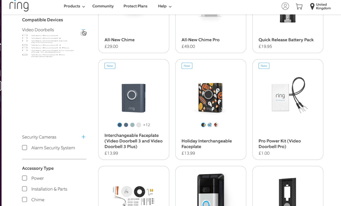
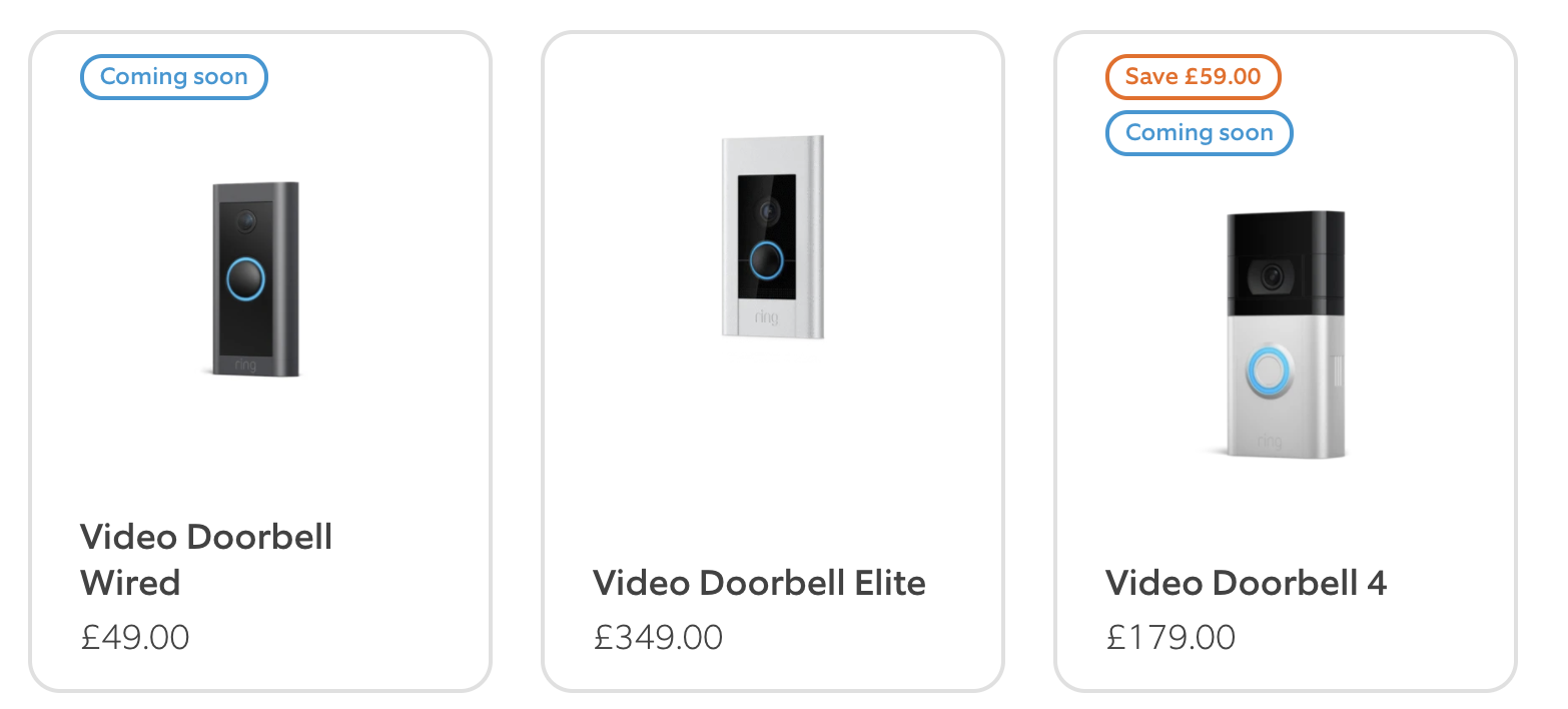
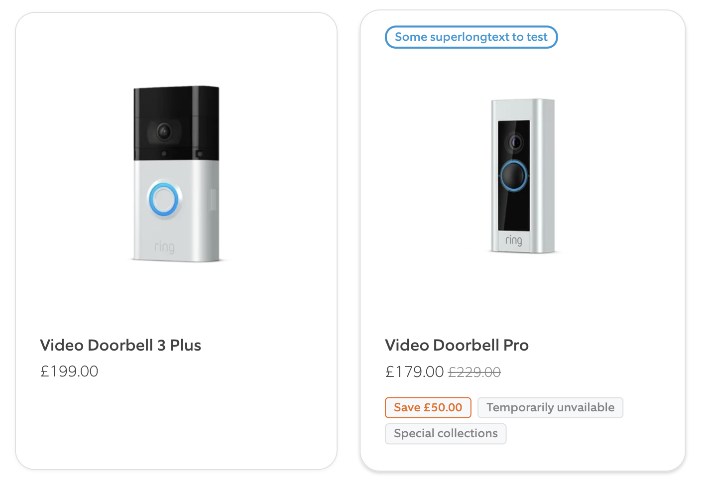
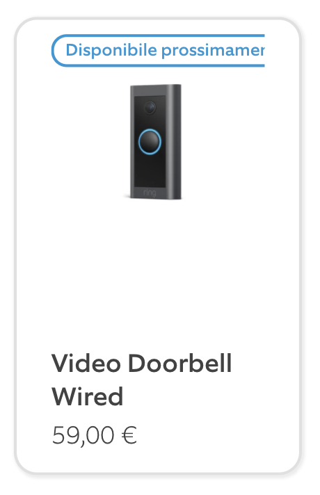
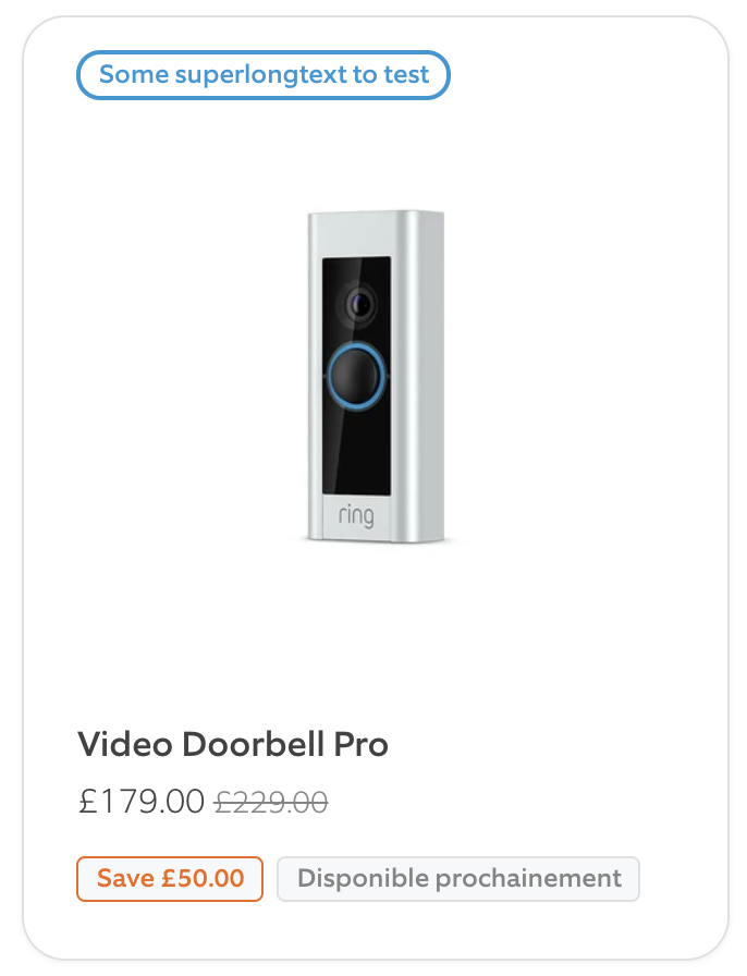
Enhancing the product badge system on Ring’s products overview now that more sales categories were added. Aimed to improve the clarity and visibility of product statuses such as availability and promotions on the program detail pages.
The original badge system suffered from several usability issues, including overlapping text on product images and a lack of adaptability for displaying various status tags, which caused visual clutter, particularly on smaller screens and in languages with longer words.
Implementation
I devised a dual-layer badge strategy to streamline the display of product information:
- Top Badges: Dedicated to critical sales messages such as “New“, “Sale“, and “Coming Soon“.
- Bottom Badges: Simpler additional notifications like “Out of Stock” or “Temporarily Unavailable“, avoiding visual competition.
- Responsive Grid Update: More breakpoints to ensure proper display across devices, to prevent overlap and enhance tile presentation.
- Automated Badge Placement: Implemented logic to dynamically position badges based on product status—automatically adding “Sold Out” or “Temporarily Unavailable” tags based on inventory.
- Interactive Elements: To address space constraints that led to text truncation, I integrated hover effects that display the full text of badges, improving user interaction without sacrificing the design integrity of the product tiles.
Result
- Clarity and Usability: The reorganized badge system significantly improved the clarity of product statuses at a glance, enhancing the user’s ability to quickly grasp important product details.
- Improved User Experience: The redesigned interface fostered a smoother navigation and interaction experience, increasing customer engagement and satisfaction.
- Adaptive Design: The new badge system was highly adaptable, accommodating a wide range of tags and seamlessly adjusting to various screen sizes to ensure a consistent user experience.
The badge system redesign for Ring’s eCommerce platform not only resolved the visual and functional issues of the old system but also enhanced the overall aesthetic alignment with Ring’s branding.
Gallery
Click image for a larger view.
Documentention
Story
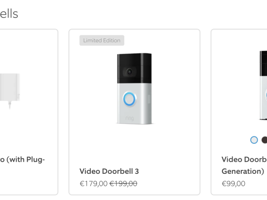
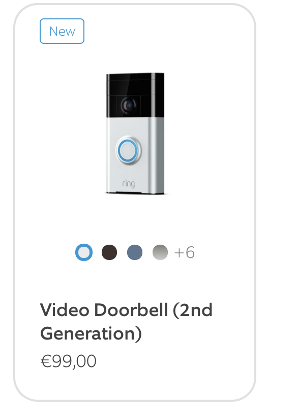
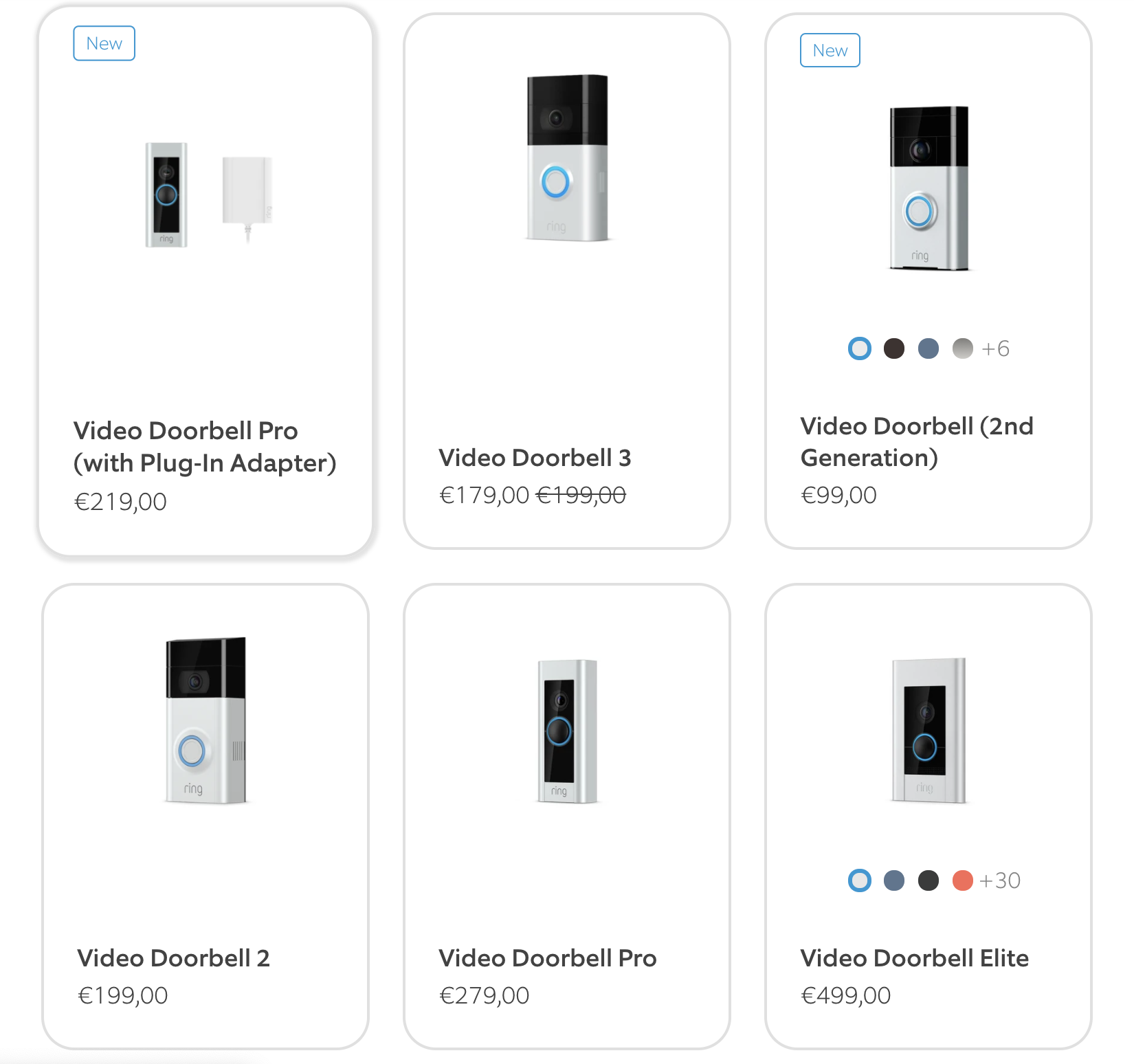
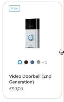
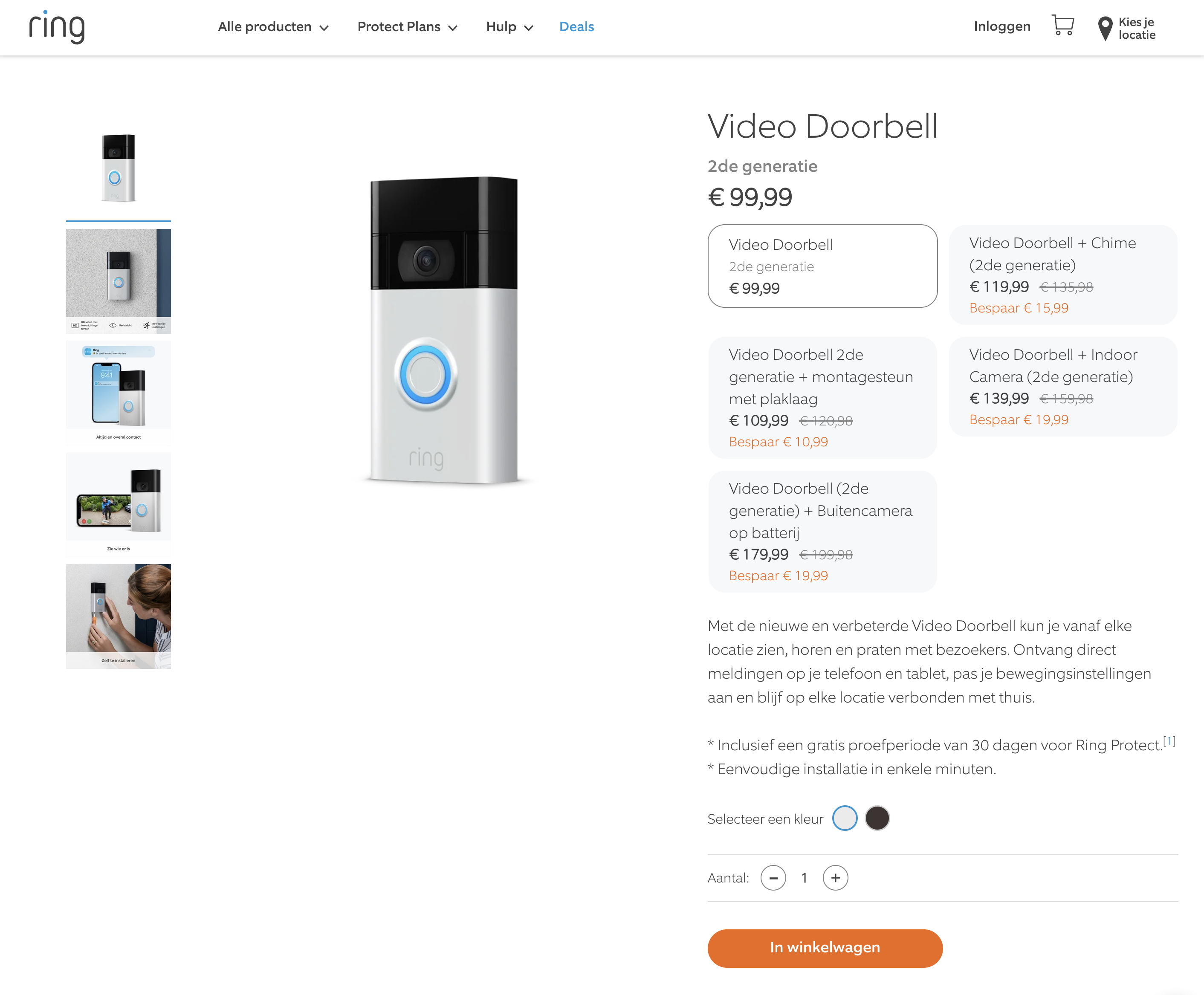
As a Front-end Developer, I leveraged my background in Design and UX/UI significantly by implementing colour options in Ring’s European eCommerce sites. The story focused on integrating dynamic color swatches and labels for product variants, which allowed customers to easily navigate and select product options directly from the product listing pages.
The primary challenge was to provide a seamless and intuitive way for users to explore different product variants without navigating away from the product listing page. It was crucial to balance aesthetic appeal with functional clarity, ensuring that the solutions catered to users with varying needs, including those with color blindness.
As a user I would like to be able to preview the colour options that belong to a product on a collection page.
and I would like to be able to preview a featured image of chosen variant
and I would like to go to the color variant of the product of the color I have chosen
So I can navigate quickly through all possible options and might get excited by a product variant that I like sooner.
Implementation
I conducted a detailed Design Study to evaluate various display methods for color variants on product listings. The study involved creating several prototypes, each illustrating different approaches such as inline color swatches, color labels below product titles and interactive elements on product images. For each prototype, I outlined the pros and cons:
- Inline Swatches: Provided immediate visibility of color options but limited space for multiple swatches.
- Color Labels: Offered a clean, minimalist look but lacked immediate visual appeal for color options.
- Interactive Image Overlays: Allowed users to see color variants on hover, enhancing user engagement without cluttering the product listings.
After thorough evaluation and feedback, the chosen solution was to implement color swatches directly below the product titles. This method efficiently utilised space while maintaining aesthetic integrity and user accessibility. The implementation involved:
- Developing the component that dynamically updated the main product image to reflect the hovered color variant.
- Integrating the component into Shopify’s existing structure using Liquid and JavaScript.
- Conducting extensive cross-browser and device testing to ensure a uniform user experience.
Result
The new feature was met with positive feedback. The implementation not only improved the visual appeal of the product listings but also significantly enhanced the user interaction, leading to increased customer satisfaction and potentially higher conversion rates.
This story highlighted the importance of thoughtful UX/UI design in e-commerce settings and demonstrated how well-executed enhancements can lead to a more engaging and user-friendly shopping experience. My role as a front-end developer was pivotal in bridging the gap between design concepts and functional e-commerce solutions, ensuring that both aesthetics and usability were elevated on Ring’s digital platforms.
Gallery
Click image for a larger view.
Documentention
This is the design case study that was done before implementation.