Modernisering AxW (MAF)
- Role:
- Front-end UX UI Team lead Design
- Company:
- SVB
- Year:
- 2018-2019
- Location:
- Location type:
- On Site
- Code stack:
- HTML CSS SASS Javascript Typescript AngularJS NPM Gulp Webpack Jasmin Karma
- Tools:
- Jira Bitbucket Azure Git
Project info
Objective
I joined the MAF team excited by the unique challenge of adding a modern front-end to an old COBOL application. This setup made it difficult to handle and present data in a user-friendly way because the old system spread information across multiple pages. For example, contact information that needed to be on one page was split across two pages.
Details
The main challenge was the limited flexibility of the legacy system, which didn’t allow data to be easily consolidated. This required creative solutions to make the interface feel smooth and connected for the user, even though the data was on separate pages.
I worked with two sub-teams and helped both with their front-end, user experience (UX), and user interface (UI) needs. My key activities included:
- Design Leadership: I guided the front-end development by improving user stories, creating prototypes, and helping implement these changes within the team.
- Team Support and Coaching: I enjoyed teaching my colleagues, improving our team’s skills and promoting a supportive work environment.
- Building a UI Team: I helped set up a dedicated UI team, hired a junior member, and brought on a specialized UX designer to enhance our capabilities.
The work I did made the MAF application much easier to use for the 1,300 SVB employees who manage various benefits. This improvement helped the staff provide better service to civilians more efficiently. My contributions helped simplify daily tasks and laid a foundation for future updates in the application’s design.
My time with the MAF team ended after 2.5 years due to government limits on freelance work, but I valued every moment of the challenge. Leading significant improvements under technical constraints was a rewarding experience that has greatly benefited my professional development. I miss working with the team and am proud of what we achieved together.
Gallery
Gallery images and Videos are not available if not logged in. Ask for login info if you would like to see the media files.
Case Studies
This list contains some of the cases I worked on, but are far from all.
Story
Tasked with enhancing the uniformity of front-end development across the SVB, I undertook the development of a detailed design component library. This aim was grounded in Atomic Design principles, which promote a methodical and component-based approach to building user interfaces.
As an developer I would like to follow the same set up for front-end code and styling as other teams, so as an organisation we present uniform code and we don’t have to redo the work for each team.
Implementation
It aimed to construct a versatile set of UI components that would establish consistency across SVB’s digital touchpoints. Initially developed to integrate with the MAF team’s AngularJS framework, the library was intentionally crafted to be extendable and adaptable, encouraging its adoption by various teams within the organisation.
The initiative began with a thorough evaluation of MAF’s existing front-end workflows, pinpointing opportunities for standardisation. I categorised UI components into atoms, molecules, and organisms, creating a logical and reusable pattern of elements following Atomic Design.
This phase included rigorous documentation, component design, and interactive prototyping, fostering a user-centered and accessible design language.
Result
The implementation became a cornerstone in unifying the look and feel of SVB’s various interfaces. It has delivered the following benefits:
- Established a consistent user interface across platforms, enhancing overall user experience.
- Optimised the workflow for developers, enabling rapid and cohesive interface development.
- Created a foundational codebase that is both scalable and easy to maintain, accommodating future advancements.
Gallery images and Videos are not available if not logged in. Ask for login info if you would like to see the media files.
Story
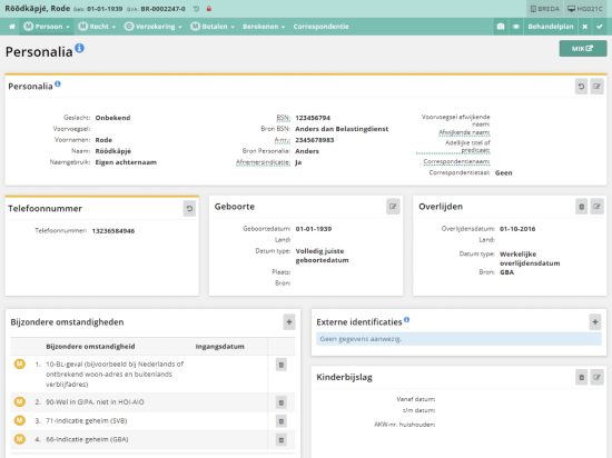
By the end of my time at MAF, I wanted to redesign the user interface for various application pages using a card component. The goal was to address the inefficiencies of the current layout—different styles across tables and fieldsets, unclear groupings, excessive scrolling, overly prominent buttons, and an overall lack of clarity and space optimisation.
The existing interface was cluttered and inconsistent, making it challenging for users to determine which elements were interactive and what information was grouped together. The interface demanded a significant amount of scrolling and featured distracting buttons, leading to an overwhelming user experience.
As a user, I would like all elements to be organized within cards because it offers a clearer and more efficient way to view and interact with the information I need without excessive scrolling or confusion from inconsistent layouts.
Implementation
I proposed a transition to a card-based layout for a more organized and space-efficient interface. Enhancements:
- Unified Styling: Introduced a uniform card design to replace the varied layouts, creating a cohesive visual language across pages.
- Intuitive Grouping: Used cards to clearly delineate related content, making it immediately apparent what belonged together.
- Interactive Cues: Redesigned buttons to be neutral in appearance, becoming pronounced only upon user interaction (hover, focus) with color cues to indicate actions, such as red for deletion.
- Space Optimization: Leveraged the flexibility of cards to avoid using the full page width unnecessarily, saving space and reducing the need for scrolling.
- Clean Interactions: Positioned interaction buttons in standard locations on the cards, contributing to a cleaner look and making user actions more intuitive.
Result
The new interface was met with positive feedback. It led to a more efficient use of space and a significant reduction in user cognitive load. Users could now navigate the application with greater ease, quickly identifying interaction points and related information with minimal scrolling.
Gallery images and Videos are not available if not logged in. Ask for login info if you would like to see the media files.
Story
As part of my efforts to streamline operations for the MAF team I developed a component to enhance the usability of the GVA number—a critical piece of data frequently accessed by users. The GVA number is extensively utilided for searching, creating, and editing records within the application.
Users experienced inefficiencies and time loss due to the manual process required to select, edit (remove dashes), and copy the GVA number. This repetitive task was identified as a significant bottleneck in daily operations.
Implementation
- Component Development: Created a specialised component with AngularJS that enabled users to interact with the GVA number more efficiently. The component automatically selects, removes any formatting (such as dashes), and copies the GVA number to the clipboard with a single click.
- Integration and Testing: Seamlessly integrated this component into the existing AngularJS application framework, ensuring compatibility and stability. Conducted thorough testing to confirm that the component functioned correctly across different scenarios.
Result
- Enhanced Productivity: The new component significantly reduced the time and effort users spent managing GVA numbers, thereby speeding up workflow processes.
- Improved User Satisfaction: Feedback from users highlighted a marked improvement in ease of use and overall satisfaction with the application’s functionality.
- Reduced Errors: Automating the selection and formatting process minimized the potential for human error, ensuring data accuracy and consistency.
Gallery images and Videos are not available if not logged in. Ask for login info if you would like to see the media files.